This section is to document my process as I make this site. It'll move at some point, but I don't want to wait and set up a new page, so for now it goes here. This is mainly a draft for my own reference.
- I learned about neocities through marginalia search, pretty much immediately wanted to make my own site.
- I put it off for a while, because I knew I didn't want it associated with my gmail account and I'd been meaning to make a non google email for a while anyway. Finally got that sorted, and made the account.
- Before signing up for neocities I spent a bunch of time wandering around the net in a way I hadn't since highschool - maybe even middleschool. I found a bunch of cool stuff that ended up inspiring this site. I love the aesthetic and colors of 90s CRPGs and the gothic grimdark aesthetic that accomapnies them. It doesn't fully embody the style I want for this site, but it felt like a good place to start. I used coolors to color pick from a bunch of screenshots of old games and used those as a starting point.
Click for screenshots from games and associated color sets
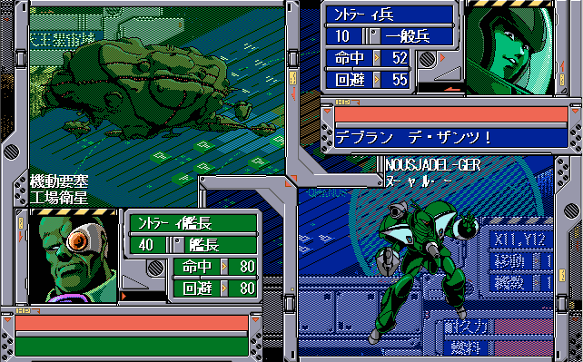
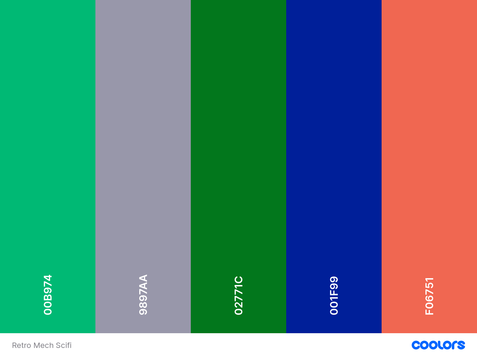
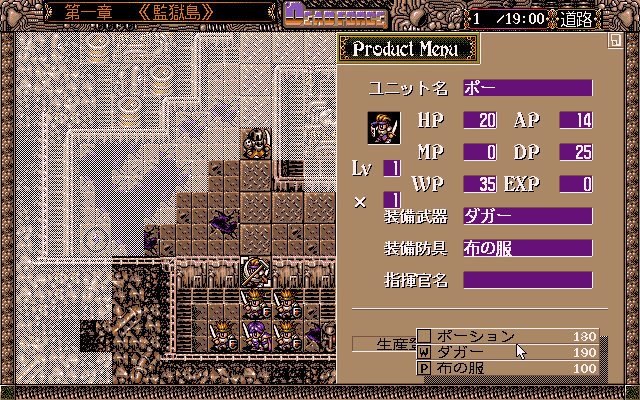
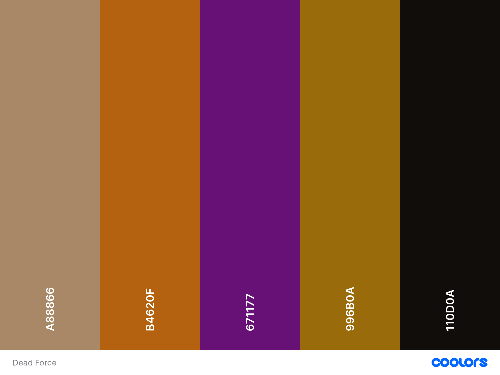
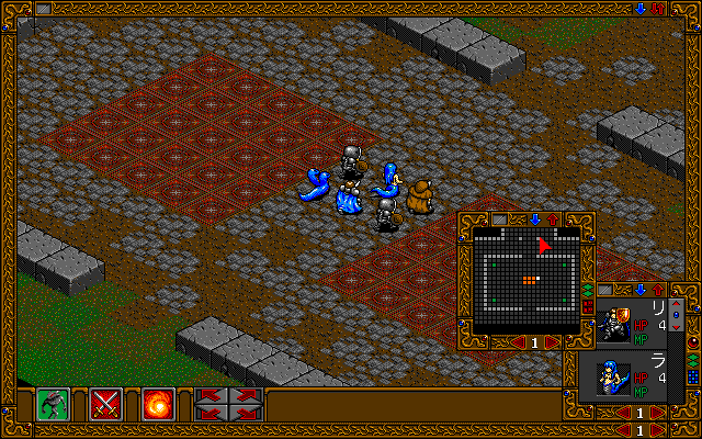
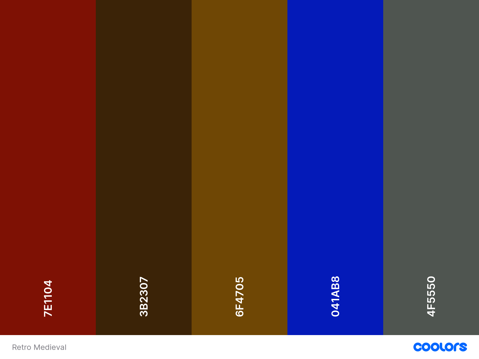
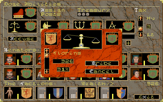
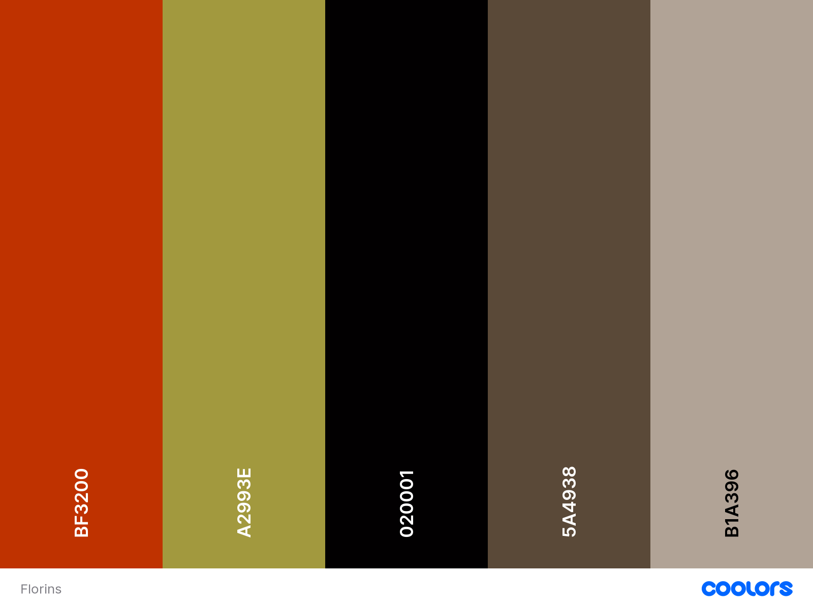
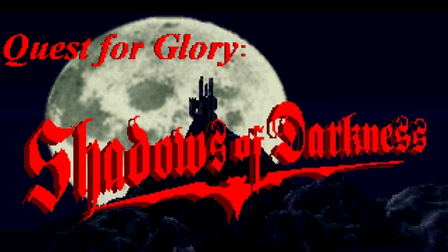
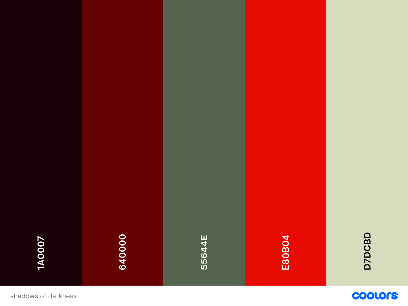
- I hadn't used HTML since I was about 13, so I followed the neocities tutorial, and then a bunch of the firefox tutorials they link to at the end of that one. I got bored somewhere in the css part, so everything else I learned has been from tutorials people wrote, or just googling stuff. At some point I will post a set of links to all the resources I used for this site, but for now it's a bookmarks folder.
- I knew I wanted some kind of 'about' page, or a bio page, so I made something like that, but then got sidetracked before I added anything to it. I ended up just writing what I wanted to say straight on the main page. What got me to actually sit down and write something was hoping that if anyone saw this site, they would have a little more context than just empty formatting and some images. At this point I'd still like to make an 'about' page, and also set up a blog function (I am looking at zonelets right now). That is probably my next task.
- Once I had something on the site, I started working on the library page. It was one of the things I had clearest in my mind from the outset: I wanted to be able to collect things I love and which inspire me all in one place. This could look like a lot of things, but this year it's been books, poetry, and fanfiction, so that's where I wanted to start. That page is still a mess, and I'm running into the limitations of my coding knowlege. I want to present the information in a way that's easier to sort through. So that page is a little bit on pause for now while I develop my html skills a little more (and develop some javascript skills, I think).
- I've made an effort to structure things with accessibility in mind as I fumble my way through building this site. I've been trying to add alt text to everything since I learned how, though I haven't added it to eveything yet. I also found a tool to check the accessibility/readability of your colors (specifically the contrast of the font color with the background color). I changed the text color used on this page as a result. I don't like it as much, but I do think accessibility is important. Eventually I think I will have two themes for the site - one with harder to read colors and fonts that I like aesthetically, and one thats a little easier to interact with. I also plan to add a "pause gif" feature to all the pages, but I have no idea when I'll get to that and honestly there are barely any gifs to pause. For now. I'm still trying to understand semantics, but I think I'm getting there.
- At this point I'm basically doing rounds of:
- Try to implement a new feature/page/idea
- Mostly succeed but now everything looks Bad
- Spend a couple days cleaning up
- (1/25/24) Spent way too many hours on spriter's resourse saving assets from old fantasy games. Edited them into borders in clip studio paint. (I love clip studio, but really not ideal for what I was doing. The only version of photoshop I have is CS6 but it is better for this. I also only have an .exe and all my site stuff is on my mac laptop. So.). Now there are stone border things on the nav and main article section. Definitely the most inefficient way I could have possibly accomplished this.
- (1/25/24) Looked up what font Magic the Gathering uses. I wasn't really looking to use their main font, but I was hoping that would help me find something else with a sort of retro fantasy vibe - and it worked. Changed the main font to Goudy which MTG used in some early iterations.
- 1.25.24 - New Font. Changed the main font to Goudy which MTG used in some early iterations. Also added borders to these text boxes - spent way too long on Spriter's Resource looking at assets from fantasy games, and then editing them in CSP. Definitely the most inefficient way I could have possibly accomplished this.
unsorted links to tools I've used (incomplete), to be cleaned up and labled later: